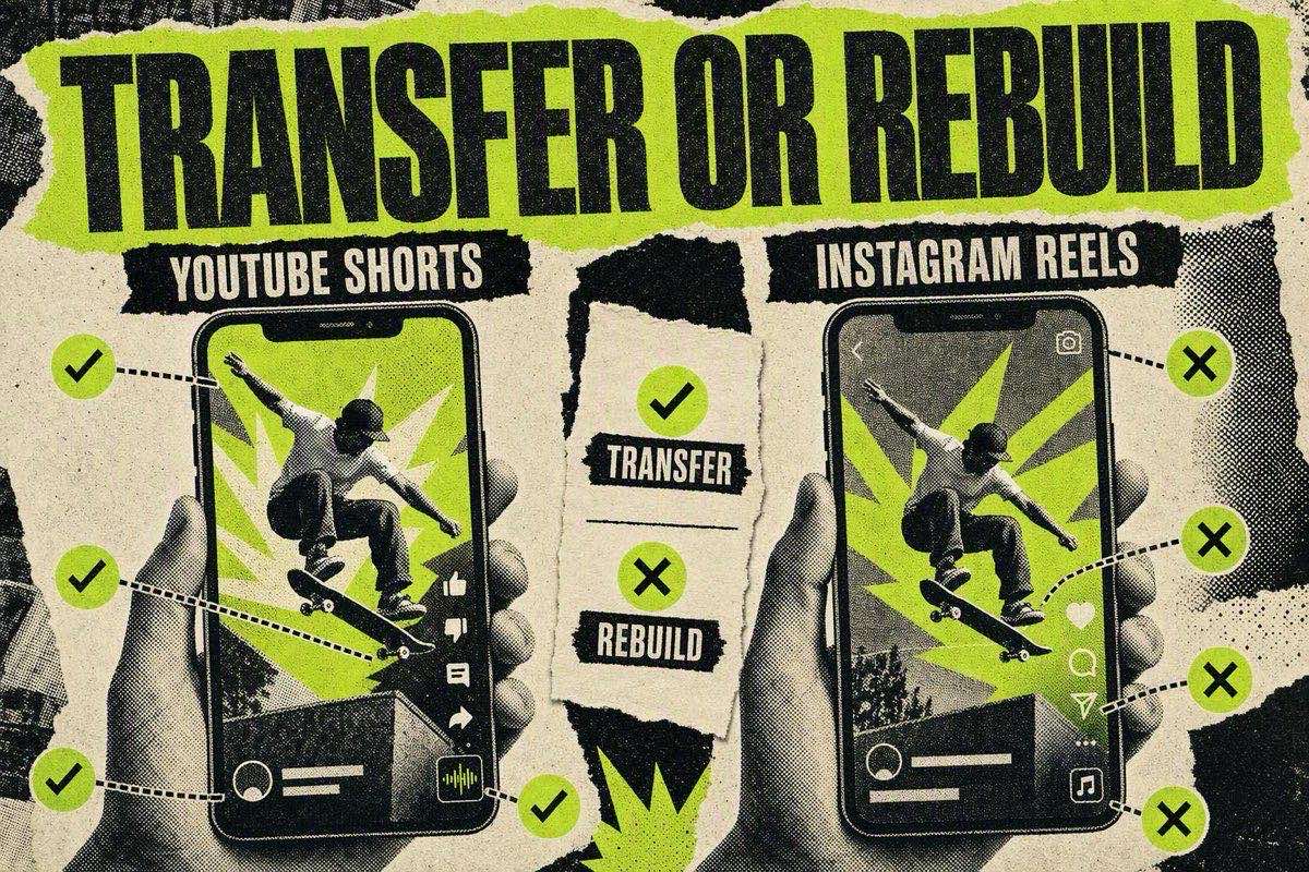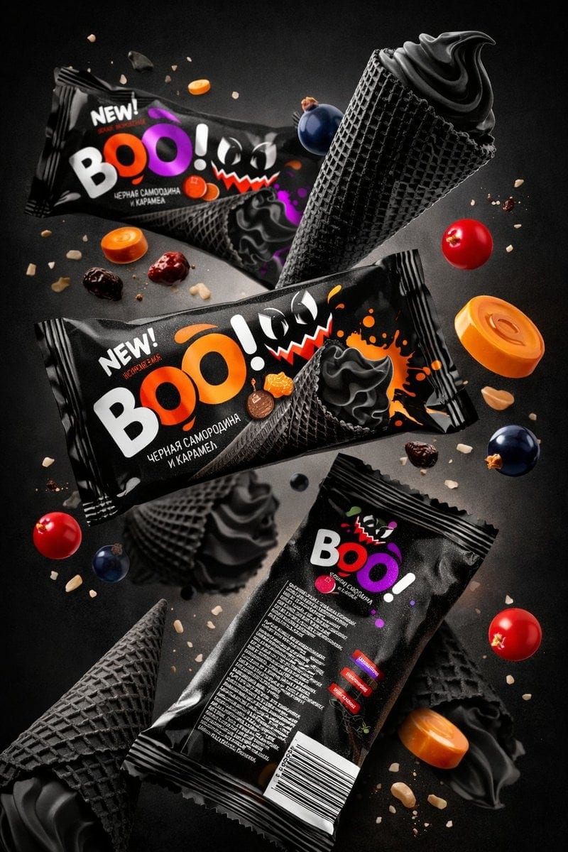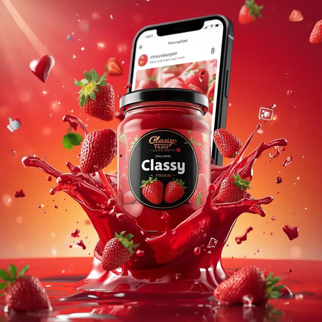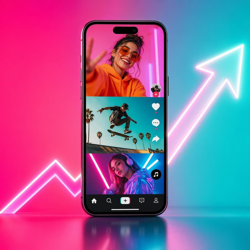
A static ad is a single non-moving image run as a paid advertisement, most often on Meta (Facebook and Instagram), Google Display, or Pinterest. A static post is the organic version: a still image published to a social feed with no motion or audio. In the right context, both can beat video.
This guide covers what sets static apart from other ad formats, when it wins, how to build one that converts, and the mistakes that kill static performance.
What counts as a static ad (and what doesn't)
A static ad comes down to one thing: no movement. It is a still image, usually a JPEG or PNG, served inside a paid placement. It does not animate, loop, autoplay, or respond to what the viewer does.
What is NOT a static ad:
- A GIF or cinemagraph (these are animated)
- A carousel ad (multiple swipeable frames)
- A video ad or Reel (motion format)
- A collection ad (hybrid)
A static post, in organic terms, is any image published to a feed that is not a video, Reel, or Story. When ad buyers say "static," they almost always mean the single-image paid format. "Static marketing" refers to any strategy that uses still-image assets rather than motion video as the primary creative format.
Why static ads still matter in a video-first world
Meta pushes Reels. YouTube Shorts has billions of views. Yet static image ads hold a core place in the paid media mix, for four practical reasons.
Production is cheaper. A product photo or graphic takes hours, not days: no camera crew, no editor, no script. That cost gap lets you test more creative angles.
They work without sound. Video leans on audio to carry half its meaning. A static ad makes its full case visually, with no load time and no need for the viewer to unmute.
They are faster to A/B test. Swapping a headline or product angle in a static is a 20-minute edit. The same change in video means a re-shoot, which is why performance teams often run statics for rapid hypothesis testing before committing to a video production budget.
They stay readable on any screen. High contrast, one focal point, and a short headline are easy to parse on a 6-inch phone. Complex motion edits often turn into mush at that scale.
Practitioners push back on the "static is dead" line directly. In a widely-viewed static-ads masterclass, a media buyer who says he has produced tens of thousands of Meta ads opens with the correction: "Most marketers think static ads are dead. They're wrong" (YouTube). It is a vendor's framing, but it matches what the numbers show, and the economics back it up. As one founder described the old constraint, "Most small brands can't afford a $15K product shoot," so they "either skip video ads entirely, or post static images that get scrolled past" (@1yoursashh). Cheap, fast, and still effective is why static keeps its place in the mix.
For a direct comparison of when to choose each format, see static ads vs. video ads.
When static wins

Static ads are not universally better or worse than video. The format wins when the product's value shows up in a single image, when the offer is the hook (a clear discount or limited-quantity signal rather than a product demo), and when you need creative volume without a large production budget. Retargeting warm audiences is another natural fit: the viewer already knows the product, so a clean image with the offer is all you need.
Video earns its place when the product must be seen in motion to be understood, when you need 15 to 30 seconds of emotional build-up for cold traffic, or when the hook is experiential and needs audio to land. Most mature paid media accounts run both and let the data allocate. For a direct comparison, see static ads vs. video ads.
The anatomy of a high-converting static ad
A converting static ad has three parts working together: the hook, the visual, and the offer.
The hook (text on image or headline)
On Meta, the primary text above the image is the first line a reader sees. On Instagram feed, the image has to carry the hook before anyone reads a caption. Either way, your static ad needs a hook that stops the scroll without relying on motion.
The hook should:
- Name a specific pain or desire the viewer recognizes immediately
- Work at a glance, without needing more than 5 words of reading
- Connect visually to the image below it
Contrarian and specificity hooks work well on static because they spark curiosity without any motion. Some proven static hook structures:
- "Stop buying [X]. Here's what actually works."
- "If your [product] keeps [failing], watch this." (adapted for image as "read this")
- "Rated 4.9 by [specific audience type]."
Our ad hooks pillar page covers the full taxonomy of hook triggers, and the free hook generator will draft 10 candidates from your product details in under a minute.
The visual
The image does the persuasion work in a static ad. It is not decoration for the text. The visual should carry one clear argument about the product.
What that looks like in practice:
- Product-first: the product in use, not on a white background. A person wearing the product, cooking with it, or holding it beats a catalogue shot.
- Before/after: two frames within one image, the problem state on the left and the resolution on the right. This is one of the most reliable formats in direct-response static advertising.
- Lifestyle scene: the product inside the aspirational context of the buyer's life. Not "shoe on a table" but "shoe on a trail with the right people."
- Close-up detail: if the product's value is in a specific material, texture, or feature, fill the frame with it. Zoom in on what makes it worth buying.
One common mistake is a designed graphic with too much text. Most platforms restrict text in ad images to 20% of the image area, and even where text is allowed, an image crowded with copy competes against itself. Keep the persuasion in the visual and the words in the headline.
The offer
A static ad without a clear offer is a brand awareness impression. For direct response, the offer needs to be visible without scrolling: a price, a discount, a free shipping hook, a limited quantity signal. The offer does not need to appear on the image itself (it can live in the primary text or headline field), but it must be above the fold before anyone clicks.
The offer closes the loop the hook opened. If your hook asks "Why does everyone switch to this mattress?" your offer should answer with something concrete: "Starting at $299. Free trial. Free shipping." Not "Shop now." Not "Learn more."
Four static ad formats that appear in high-performing campaigns
These formats show up repeatedly across direct-response static ads. No numbers are attached, so plug in your real figures.
The authority credential: Full-bleed product image with a professional or editorial testimonial overlaid. Works for health, fitness, and wellness products where endorsement matters.
The comparison: Two columns, same background. Left: "the old way" (messy, expensive, slow). Right: "our way." Positions the product as a category upgrade without a word of body copy.
The proof screenshot: A real five-star review (or three stacked reviews) with the product image in the corner. UGC voice reads as specific and authentic in a way branded copy rarely does.
The number anchor: A prominent real number on the image (reviews, repurchase rate, years in market) with the product photo as the background. Only works when the number is impressive without context.
Common static ad mistakes
Too many fonts and colors. A static ad is not a poster. Use one typeface, two colors, and a clear hierarchy. If you have to explain what to look at first, the image failed.
Stock photos over real product images. Generic stock signals that the brand does not have enough proof to show the real thing. Real product photos, even imperfect ones, beat polished stock in most direct-response contexts.
No visual hook. A product on a nice background makes the viewer read the text to understand the argument, and most will not. The image itself has to make the claim.
Wrong aspect ratio for the placement. Publish a 16:9 landscape image into a 4:5 feed slot and it gets cropped or letterboxed. Build the asset for the placement. Check specs in the Facebook ad sizes cheatsheet before you brief anyone.
Testing image and copy at the same time. Change one element per test. If both change and performance improves, you cannot tell which one earned the win.
Frequently asked questions

What is a static post?
A static post is any social media post made up of a single still image, with no video, animation, or motion. In organic social, it contrasts with Reels, Stories, and carousels. In paid advertising, it means the single-image ad format on platforms like Meta (Facebook and Instagram).
What is static marketing?
Static marketing is any marketing strategy that uses still images as the primary creative format instead of video or animation. It covers static social posts, single-image display ads, print ads, and still-image email banners. The term is usually set against "video marketing" or "motion marketing" to describe the image-first approach to paid and organic content.
Are static ads better than video ads?
Neither is universally better. Static wins on cost efficiency and direct-response metrics when a single image can make the product argument. Video wins for education, emotional build-up, and cold audiences. Most accounts that scale run both. For the full breakdown, see static ads vs. video ads.
How big should a static ad be for Facebook and Instagram?
For Meta Feed, the recommended size is 1080x1080px (square, 1:1) or 1080x1350px (portrait, 4:5). For Stories and Reels, use 1080x1920px (9:16). Check the full current specs, including file-size limits and text area restrictions, in the free Facebook ad sizes cheatsheet.
What makes a good static ad hook?
A good static ad hook works visually at a glance, names a specific pain or desire, and earns the next second of attention without relying on motion or audio. Contrarian statements, proof claims with real numbers, and specificity-led lines ("if your X keeps doing Y") tend to beat generic benefit statements. Use the free hook generator to draft several candidates fast, then pick the one that sounds most like something your buyer would say to a friend.
Can you use the same static ad on Facebook and Instagram?
You can, but check that the aspect ratio works for each placement. Facebook Feed and Instagram Feed both accept 1:1 and 4:5. Instagram Stories requires 9:16. Test performance by placement separately: the same image does not always perform the same way on both feeds.
Start with one strong image
Static ads are the fastest format to test, and they reward clarity over production value. One focused image with a strong hook, a single visual argument, and a concrete offer will beat a beautifully designed static that has no clear point.
Write the hook first (or draft 10 with the free hook generator), confirm your specs with the Facebook ad sizes cheatsheet, and put one clean test into your next campaign. A running ad you keep optimizing will beat the one you are still perfecting.

The AI Ad-Making Kit
$99Make hyperreal AI video and image ads for any brand, with free AI tools. No camera, no agency.
- 10 modules
- 300+ hooks
- 500+ prompts
Canva ad templates, free.
Proven D2C ad layouts. Swap in your product, export, launch.
Browse templates →Want to act on what you just read?
Browse 3,400+ free, Canva-ready ad templates sorted by industry. One click to open, five minutes to customise.
Browse Free Templates