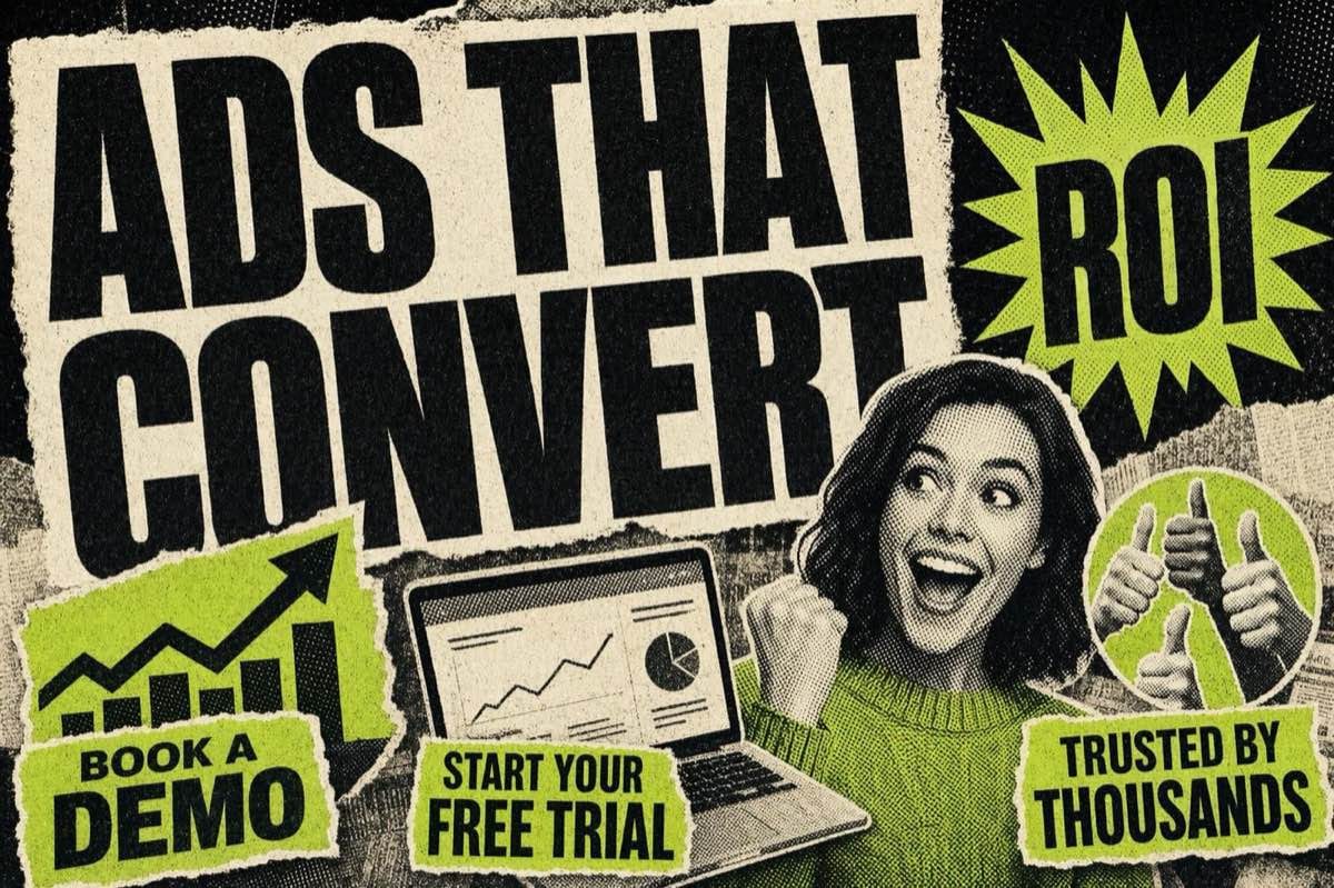
Good SaaS ads don't sell software. They sell the ten minutes a founder gets back, the churn number that stops climbing, the report nobody has to build by hand at 11pm. Below are 15 SaaS Facebook ad patterns that B2B teams run today, grouped by angle, free trial, ROI-led, demo CTA, social proof, and comparison, with the mechanism behind each one so you can adapt it to your own product instead of copying it word for word.
Why Most SaaS Ads on Meta Underperform
B2B SaaS buyers scroll Facebook the same way everyone else does: fast, distracted, and not looking to buy software. Recent 2025-2026 benchmark data puts average B2B SaaS click-through rates on Meta at roughly 0.5-1.0%, well below most B2C categories, which is exactly why the ad has to do more work than "here's our product."
The failure pattern is consistent: a screenshot of the dashboard, three bullet points about features, a "Learn More" button. That ad describes the product instead of dramatizing the problem it solves. Feature-first creative reads like a spec sheet, and nobody stops scrolling for a spec sheet.
The 15 patterns below fix that by leading with an outcome, a number, or a recognizable pain point, and only bringing the product in as the mechanism.
15 SaaS Facebook Ad Examples by Angle
Free trial angle
1. The "no card, no catch" trial ad. Static image, one line of copy: "Try it free for 14 days. No credit card." The entire ad exists to remove the one objection stopping a click, the fear of a surprise charge. Works best on cold traffic where trust hasn't been built yet.
2. The "what you get in week one" trial ad. Instead of promising a generic trial, it lists what happens in the first 7 days: "Day 1: connect your data. Day 3: your first report. Day 7: you'll know if this replaces your spreadsheet." Concrete milestones make the trial feel low-risk because the buyer can picture the outcome before signing up.
3. The self-selecting trial ad. "If you're still exporting CSVs into a deck every Monday, start your free trial." Names the exact workflow the buyer is stuck in. People who recognize themselves click; people who don't were never the audience.
ROI-led angle
4. The hard-number ROI ad. Leads with a specific, sourced metric instead of a vague promise: "Teams using [Category] tools cut manual reporting time by measurable hours per week" style claims, always tied to a real case study or aggregate benchmark, never a made-up percentage. The specificity is what makes it credible, so only use a number you can defend if someone clicks through and checks.
5. The cost-of-inaction ad. Reframes ROI as a loss instead of a gain: "Every week without automated invoicing costs a 10-person team roughly one full workday in manual entry." Loss-framed math tends to outperform gain-framed math with the same numbers, because the fear of an ongoing cost is a stronger trigger than the promise of a future saving.
6. The before/after dashboard ad. Two screenshots side by side, "before" a messy spreadsheet, "after" a clean automated view. No copy needed beyond a short caption. This works because it's a visual proof point, not a claim, the buyer draws their own ROI conclusion from what they're looking at.
Demo CTA angle
7. The "book a specific outcome" demo ad. Not "Book a Demo," but "Book a 15-minute call to see your own data in the dashboard." Naming the format (15 minutes) and the payoff (your own data) lowers the perceived commitment versus a vague "demo."
8. The founder-led demo ad. A short video of the founder or a senior engineer walking through one feature, unscripted, screen-recorded. B2B buyers trust a person narrating a real screen more than a polished montage, especially at the top of a category where the brand has no reputation yet.
9. The objection-preempt demo ad. Copy that names the buyer's likely hesitation before they think it: "Worried it won't integrate with what you already use? See it connected to your stack live on the call." Naming the objection out loud lowers defensiveness and gets more qualified people booking.
Social proof angle
10. The logo wall ad. A grid of customer logos with one line: "Trusted by teams at [logos]." Works only when the logos are real and recognizable to the target buyer; a wall of unfamiliar names does nothing. Effectiveness scales with how well-known the logos are to the specific audience segment being targeted.
11. The specific-quote testimonial ad. Not "Great tool!" but a named person, named role, named result: "Our support team went from a two-day backlog to same-day replies," quoted from [Name], Head of Support at [Company]. Specificity signals the quote is real and not marketing copy dressed as a testimonial.
12. The migration-story ad. "We switched from [Category] tool after three years and never looked back." Implies a considered decision, not an impulse buy, which matters for buyers doing their own vendor comparison research.
Comparison angle
13. The neutral feature-comparison ad. A simple table: three columns, your product plus two alternatives, feature rows checked or unchecked. Framed as an honest comparison rather than a takedown. Buyers doing bottom-of-funnel research respond to comparison content because it matches what they're already doing in another tab.
14. The "switch in a weekend" ad. Targets users of a specific competitor with a migration-time promise: "Import your data from [Category] tool in one afternoon." Directly answers the switching-cost objection that keeps buyers on an inferior incumbent.
15. The category-education ad. For a genuinely new category, the ad teaches the concept before selling the product: "You don't need three tools for this anymore. Here's what one does instead." Useful when the buyer doesn't yet know the category exists, so a direct-response ad about the product would fall flat.
How to Pick the Right Angle for Your Funnel Stage
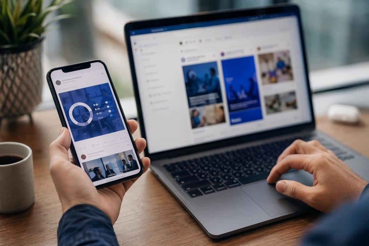
Match the angle to where the buyer sits, not to what looks impressive in isolation:
- Cold audience, no brand awareness: lead with category-education or a specific pain-point callout (#3, #15). Selling ROI to someone who doesn't know your category exists is premature.
- Warm audience, has seen the brand: ROI-led and social proof angles (#4, #10, #11) do the heavy lifting, they're answering "is this real" and "does this work," not "what is this."
- Bottom of funnel, comparing vendors: comparison and objection-preempt angles (#8, #9, #13, #14) meet the buyer exactly where they are, mid-research, tab open to a competitor.
For the actual hook line on any of these, the trigger families in 50 proven ad hook formulas for e-commerce translate directly to B2B, swap the product category and the numbers stay the mechanic.
Testing These Patterns Without Wasting Spend
B2B SaaS accounts often have smaller daily budgets than D2C, so testing discipline matters more, not less:
- Run 3-4 angles at once, not 15. Pick one from each funnel stage above and let the algorithm find signal before adding more variants.
- Judge on cost per qualified lead, not CPC. A cheap click that never books a call is worse than an expensive one that does. Average CPC for SaaS on Meta sits in the $1.50 to $3.50 range, but that number means nothing without a lead-quality filter behind it.
- Reuse the winning hook across formats. A hook line that wins as a static image is worth testing as the first line of a founder-led video (#8) before writing a new one from scratch.
If you want a faster way to draft the opening line for any of these ads, the free AI hook generator will turn a product description into scroll-stopping openers you can slot into any of the 15 patterns above.
Format Choices: Static vs Video for SaaS Ads
Most of the 15 patterns above work as either a static image or a short video, but the format changes what the ad can prove. A static image is faster to produce and tests cheaper, so it's the right default for the ROI-led and comparison angles (#4, #6, #13), where the proof is a number or a table the eye can scan in one glance. Video earns its extra production cost on the demo and founder-led angles (#7, #8), where watching a real person narrate a real screen builds trust that a still image can't.
A common mistake is defaulting to video because it feels more "premium." For a cold B2B audience that has never heard of the brand, a static ad with a sharp, specific hook line often outperforms a video nobody watches past the first two seconds. Save video for retargeting and demo-stage audiences who are already warm enough to keep watching. Our full breakdown of static ads vs video ads covers the data on when each format wins by objective.
Common Mistakes That Kill SaaS Ad Performance
Beyond picking the wrong angle, a handful of execution mistakes show up repeatedly in underperforming B2B campaigns:
- Burying the outcome under the feature. "Automate your workflows with our AI-powered platform" describes the mechanism, not the result. "Stop re-typing the same data into three tools" describes the result. Buyers click on results.
- Using a stock photo of people in a meeting. It's the single most recognizable "this is an ad" signal on the platform, and recognizable-as-an-ad is the fastest way to get scrolled past. A real screenshot, a real founder, or a real customer quote beats a stock photo every time.
- One ad, one audience, forever. The angle that wins with a cold prospecting audience rarely wins with a retargeting audience seeing the brand for the fifth time. Match the angle to the audience temperature described above, and refresh creative before frequency climbs and performance decays.
- No clear next step. "Learn More" is not a CTA, it's a placeholder. Every pattern above works better paired with a specific action: start the trial, book the 15-minute call, see the comparison table.
FAQ

Do Facebook ads actually work for B2B SaaS?
Yes, but differently than for D2C. Expect lower click-through rates (roughly 0.5-1.0%) and a longer path from click to paid customer, since B2B buying cycles involve more than one decision-maker. Facebook works best for building pipeline (demo bookings, trial signups) rather than one-click purchases.
What's a good cost per lead for SaaS Facebook ads?
It varies widely by vertical, but standard B2B leads commonly fall in the $40-65 range, with qualified sales-ready leads costing significantly more. Treat any published CPL benchmark as directional, your own funnel's conversion rate from lead to customer is the number that actually matters.
Should SaaS ads show the product UI?
Only after the hook has earned attention. A dashboard screenshot as the very first frame reads like a feature list. A dashboard screenshot as the payoff after a strong hook (see #6, the before/after pattern) works because it's proof, not an opener.
How many ad variants should a small SaaS team test at once?
Three to four angles, each with one or two creative variations, is enough to find a signal without splitting a modest budget too thin. Once one angle clearly wins on cost per qualified lead, iterate inside that angle before testing a completely new one.
Steal These Patterns for Your Own Product
The 15 patterns above are angles, not scripts, the mechanism (specific ROI, named objection, real logo, concrete trial milestone) is what transfers, the copy is what you adapt. Start with whichever funnel stage matches where most of your traffic sits today.
Browse 1,500+ free AI ad prompts to draft hook-first variants fast, study how real ads are built piece by piece in the teardown library, and see the fill-in-the-blank hook formulas that carry over from e-commerce to B2B in 50 proven ad hook formulas. One new winning hook breakdown lands in the newsletter every week.
The AI Ad-Making Kit
$99Make hyperreal AI video and image ads for any brand, with free AI tools. No camera, no agency.
- 10 modules
- 300+ hooks
- 500+ prompts
Canva ad templates, free.
Proven D2C ad layouts. Swap in your product, export, launch.
Browse templates →Want to act on what you just read?
Browse 3,400+ free, Canva-ready ad templates sorted by industry. One click to open, five minutes to customise.
Browse Free Templates