The most effective ads in 2026 often look nothing like ads. They look like a post a friend shared, a screenshot of a comment thread, a product review someone photographed with their phone, or a piece of content that wandered in from a creator's organic feed. The design intent is the same across all of them: signal to the viewer's brain that this is not an interruption, it is content.
This is not new as a concept. What is new is the scale at which it is working, and how much more sophisticated the execution has gotten.
What "Native-Style" Actually Means in Practice
The format has several common executions:
Screenshot-style ads. The creative is designed to look like a screenshot of a Twitter/X thread, a Reddit comment, a text conversation, or a product review. The "product" is implied by the context of the screenshot, not displayed as a staged hero shot.
Shared post aesthetic. The ad looks like someone has re-shared a post inside a feed, complete with a "shared by" header, engagement numbers, and a comment thread visible below the post. Meta has cracked down on misleading interface elements in ads per their ad policies, so the line between genuine native aesthetics and deceptive mimicry matters here. The creative should be authentic in what it represents, not fake a UI.
Comment card format. A testimonial or customer review is designed as a card that looks pulled directly from a comment section, with a profile photo, name, and star rating. This borrows the visual grammar of the review page without recreating a platform's actual interface.
Organic-quality video. Shot handheld, slightly underlit, slightly shaky, with captions that look like someone manually typed them in a Stories editor. The production defects are intentional signals of authenticity.
Why It Works
The mechanism is attention pattern disruption. Every person who spends significant time on social media has developed a fast filter for branded content: the clean composition, the logo in the corner, the studio lighting, the "Shop Now" button that is a few pixels too large. These visual signals register as "ad" and the brain routes around them faster than conscious thought.
Native-style creative does not trigger those filters in the first half-second. The viewer processes it as content before their ad-skip instinct activates, and by then they are already reading.
A 2023 study by Kantar and Meta on creative effectiveness found that ads that felt relevant and "fit in with other content" on the feed scored significantly higher on recall and engagement than those perceived as promotional. The research is summarized in Meta's Creative Best Practices guide.
Who Is Using It Best
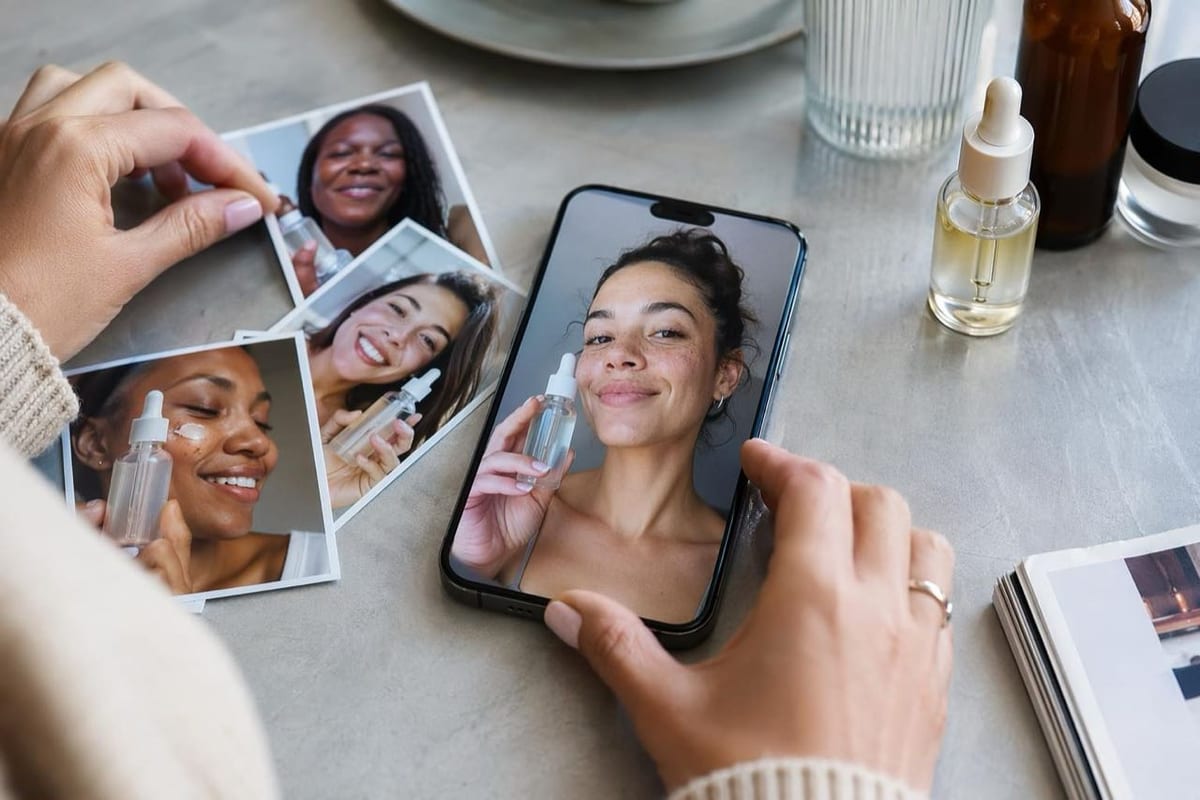
Brands in high-trust-deficit categories have adopted this the most: supplements, skincare, financial services, and anything where the viewer's default posture is skepticism. When your audience does not trust product claims at face value, presenting those claims through the visual grammar of a peer's organic content, rather than a brand announcement, changes the reception.
D2C brands with strong customer communities are also well-positioned here because they have access to real screenshots, real comments, and real organic content to work from, rather than manufacturing the aesthetic artificially.
How to Try It This Week
Pick your most enthusiastic real customer review. Design it as a comment card: profile photo (real or stock, ideally matching your ICP), name, 5-star rating display, and the verbatim review text. Add your product image at roughly the same quality as a product photo someone would snap on their kitchen counter. Run it against your current best-performing static ad.
Separately, find one genuine comment or DM from a real customer that describes a specific result ("I've been using this for 3 weeks and my knees don't hurt on stairs anymore"). Screenshot the conversation (obscure the customer's surname), add your brand name and logo as a small stamp in the corner, and test it as a creative variation.
If either outperforms your polished creative, you have a content format to build a library around.
What to Watch Out For
Meta's policy on misleading interface elements. Ads that use realistic platform UI elements (fake notification badges, fake "Sponsored" labels, fake engagement counts that do not reflect reality) violate Meta's ad policies and will be rejected or pulled. The native aesthetic has to come from content styling, not from impersonating Meta's own interface.
Frequency fatigue is faster. Because the format relies on surprise, an audience that sees the same "screenshot" style ad 8 times will tune out faster than they would with a standard brand ad. Keep your creative library large and refresh frequently.
Do not manufacture false social proof. A fake comment from a fake reviewer presented as real is not just ethically problematic; it is a policy violation and an Advertising Standards Council of India (ASCI) concern in the Indian market. Use real customer language, even if you are designing the card yourself.
The AI Ad-Making Kit
$99Make hyperreal AI video and image ads for any brand, with free AI tools. No camera, no agency.
- 10 modules
- 300+ hooks
- 500+ prompts
Canva ad templates, free.
Proven D2C ad layouts. Swap in your product, export, launch.
Browse templates →Want to act on what you just read?
Browse 3,400+ free, Canva-ready ad templates sorted by industry. One click to open, five minutes to customise.
Browse Free Templates