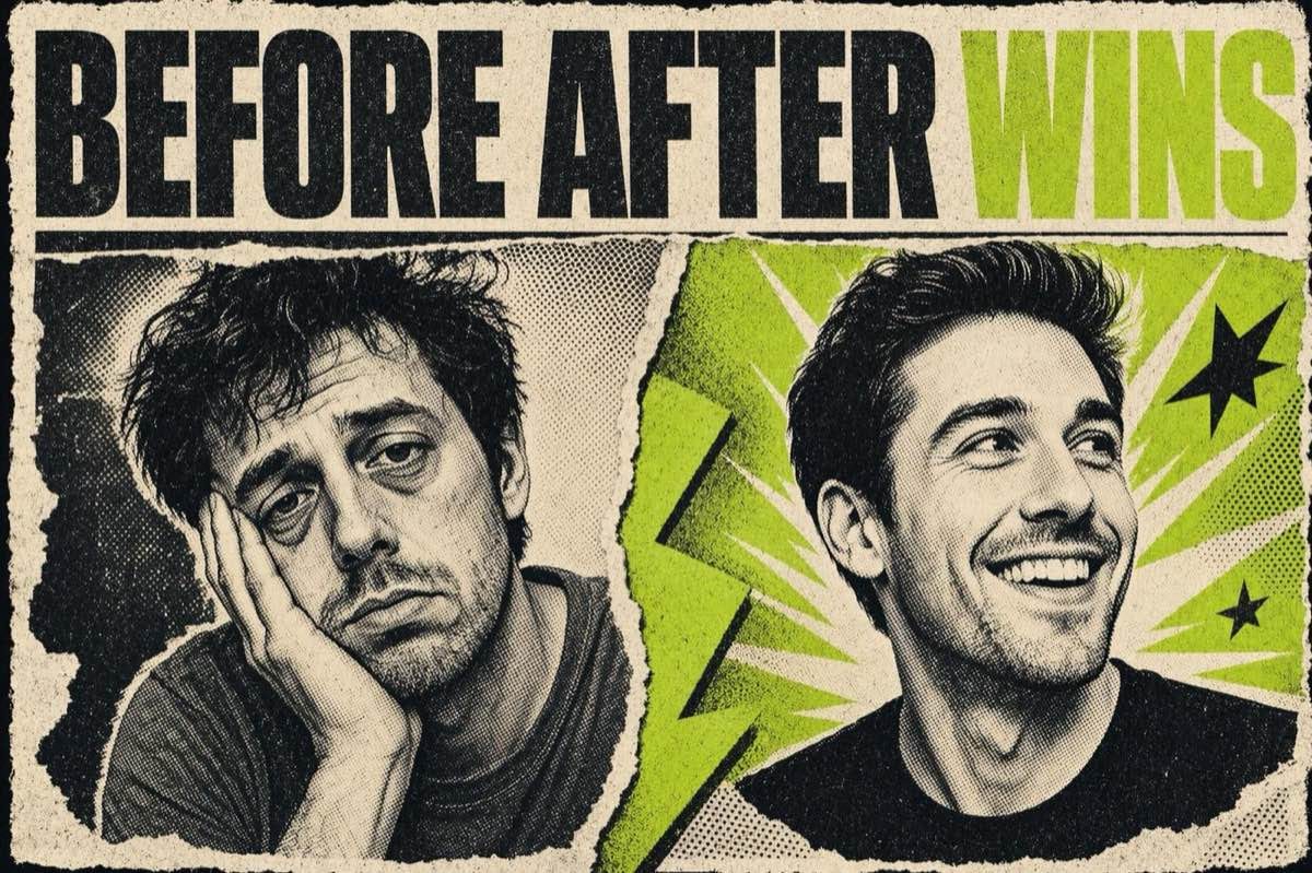
The before/after format has been a staple of direct-response advertising for decades. It works because it compresses the entire value proposition of a product into two frames: problem on the left, solution on the right. No explanation needed. The viewer's brain does the work.
What has changed in 2026 is the execution. The blunt "before" and "after" label plastered on two images is almost never the top performer anymore. The brands doing this well have evolved the format into something more specific, more narrative-driven, and more credibly grounded in proof.
Why the Format Still Works
The before/after structure exploits one of the most reliable patterns in human attention: contrast. The brain is wired to notice difference. A side-by-side image or a time-cut video that shows a visible change demands attention processing in a way that a static product hero shot does not.
Meta's own creative guidance in their Ad Creative Best Practices notes that transformation-driven creative performs particularly well in the consideration phase because it answers the question the viewer is already asking: "If I buy this, what will actually be different?"
The format is also platform-agnostic. A before/after works in a static image (two panels), a short video (the reveal cut), a carousel (card 1 = problem, cards 2-4 = progress, final card = result), and in UGC (the testimonial version, where someone narrates their own before/after experience).
What Is Working Right Now
Specific time frames. "After 30 days" beats "after" because the specificity makes the claim more credible and gives the viewer a concrete expectation to evaluate. "After 3 uses" works better for products that deliver fast visible results. Ground the timeframe in reality that is true for your product.
Third-party or customer-generated befores and afters. A brand-produced before/after has an inherent credibility gap because the viewer knows the brand controls both images. A customer-submitted before/after, or a before/after from a verified third-party test, carries more trust. Brands are increasingly building post-purchase flows specifically to collect photo or video proof from real customers for use in ads.
The "unexpected" before. A before that is more extreme or more specific than the viewer expected creates a stronger contrast with the after. "Before: 47 browser tabs open and still not done" followed by "After: my whole project managed in one view" is more surprising than "Before: disorganized. After: organized."
Sound-on vertical video for the reveal. A short video (15-30 seconds) that shows the transformation in progress, rather than just the endpoints, performs well on Reels and Shorts because it earns watch time through the arc. The viewer is compelled to stay to see the result.
Who This Is Right For
Before/after creative is strongest for products where the result is visible or measurable. Skincare, home organization, fitness, cleaning products, food, software that produces visible output (design tools, document tools, data tools). Categories where the result is subjective, internal, or abstract (emotional wellness, general supplements with no visible effect, some financial products) require more care because unsubstantiated "after" claims create regulatory risk, particularly under ASCI (Advertising Standards Council of India) guidelines for health and wellness claims.
How to Execute It This Week
Static two-panel format: take your best product result photo (this is your "after") and find a comparable "before" image that shows the problem clearly without being gratuitously unappealing. Keep both images at the same resolution and lighting quality. If the before looks too staged, the before/after loses credibility.
UGC reveal video: brief a creator or a willing customer to film themselves holding up the product, then showing the "before" state (a problem they are experiencing), using the product, and revealing the result. No studio, no ring light required. Authenticity outweighs production value here.
Carousel version: use Card 1 as the "before" hook (problem statement in text, before-state visual), Cards 2-3 as the middle (product in use, a review quote, a key ingredient or feature), and the final card as the "after" (result + CTA). This version earns more dwell time per viewer than a static side-by-side.
What to Watch Out For
Unsubstantiated transformation claims. "Cleared my skin in 7 days" as a universal claim creates legal risk. Either present it as one person's experience with a disclosure ("Results vary"), or use language that describes the product mechanism rather than a guaranteed outcome.
Over-dramatic befores. A "before" image that is darkly lit, unflattering to the point of embarrassment, or clearly staged as a worst case will undermine trust. The viewer needs to believe the before was real.
Ignoring the hook frame. In video formats, the "before" is your hook. If the opening frame is just the label "BEFORE" with no visual or emotional content, viewers scroll before the contrast lands. Start with the problem in motion: show it, do not label it.
Platform policy on before/after health claims. Meta restricts before/after images in weight-loss advertising under their Advertising Policies. If your product is in a health, weight, or body-image adjacent category, review the policy before running before/after creative to avoid ad rejection.
The AI Ad-Making Kit
$99Make hyperreal AI video and image ads for any brand, with free AI tools. No camera, no agency.
- 10 modules
- 300+ hooks
- 500+ prompts
Canva ad templates, free.
Proven D2C ad layouts. Swap in your product, export, launch.
Browse templates →Want to act on what you just read?
Browse 3,400+ free, Canva-ready ad templates sorted by industry. One click to open, five minutes to customise.
Browse Free Templates